

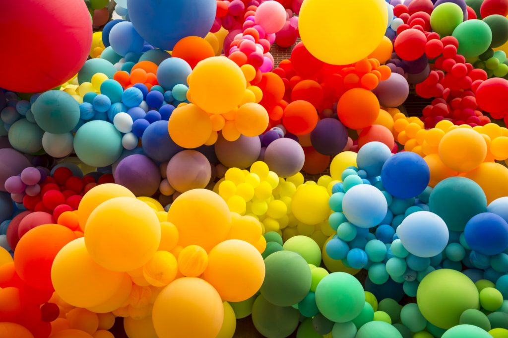
Colors are all around us, painting our world with emotions, memories, and feelings. They can evoke joy, calm us, or even make us feel uneasy. Have you ever wondered why a bright blue sky can lift your spirits, or why a cozy, candlelit room feels so inviting? Colors have a profound impact on our mood, and understanding this can help us create spaces and experiences that enhance our well-being. In this article, we’ll explore about how different colors affect our mood and bring us back to life.
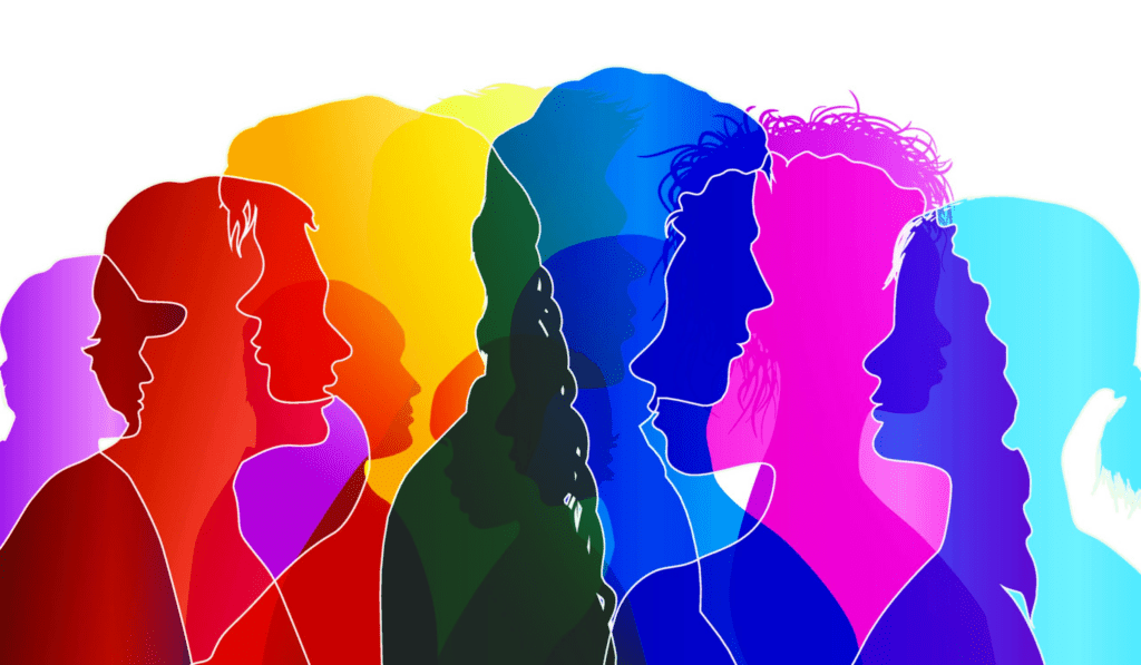
The Connection between Colors and Mood
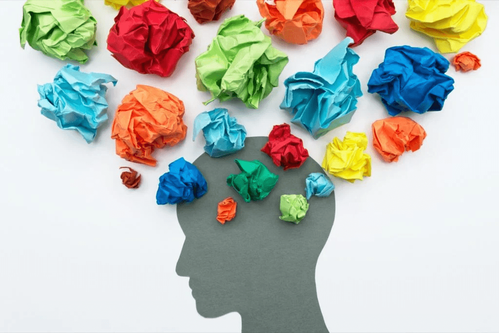
The connection between colors and mood isn’t just a figment of our imagination; it’s backed by science. Our brains respond to colors in unique ways, thanks to how our eyes perceive light. When light enters our eyes, it hits the retina, which contains cells called photoreceptors. These photoreceptors convert light into electrical signals that travel to the brain, influencing our emotions and behavior.
Different colors have different wavelengths and energies, which can stimulate various psychological and physiological responses. For example, warm colors like red, orange, and yellow are often associated with energy and excitement, while cool colors like blue, green, and purple tend to evoke calm and relaxation.
Different Colors that Affects our Mood
1. Red: Energizing and Stimulating
Red is a color that demands attention. It is often associated with passion, excitement, and energy. Red can increase heart rate and blood pressure, making it an effective color for creating a sense of urgency and vitality.
- Practical Tip: Use red in areas where you need a boost of energy, like a home gym or a creative workspace. Red accents, such as cushions or artwork, can add a vibrant touch without overwhelming the space.
2. Orange: Warm and Inviting
Orange combines the energy of red with the happiness of yellow, creating a warm and inviting atmosphere. It can stimulate creativity and social interaction, making it an excellent choice for living rooms and dining areas where people gather.
- Practical Tip: Incorporate orange through accessories like throw blankets, vases, or curtains. Moreover, an orange accent wall can add a cheerful and cozy vibe to a room.
3. Yellow: Cheerful and Uplifting
Yellow is the color of sunshine and happiness. It’s associated with positivity and can instantly brighten up a space, making it feel more welcoming and cheerful. However, too much yellow can lead to feelings of frustration and anxiety, so it’s best used in moderation.
- Practical Tip: Use yellow in spaces where you want to promote a happy and energetic atmosphere, such as kitchens and playrooms. Yellow flowers, pillows, or wall art can add a cheerful touch.
4. Blue: Calm and Tranquil
Blue is a calming color that can help reduce stress and create a sense of peace. It’s often used in bedrooms and bathrooms to promote relaxation and tranquility. Blue is also associated with trust and dependability, making it a popular choice for workspaces.
- Practical Tip: Use light shades of blue for a soothing effect in bedrooms and bathrooms. Darker blues can create a sophisticated and serene atmosphere in living rooms and offices.
5. Green: Refreshing and Balancing
Green symbolizes nature and renewal. It has a calming and refreshing effect, making it a perfect choice for spaces where you want to feel balanced and rejuvenated. Green is also associated with health and well-being.
- Practical Tip: Incorporate green through houseplants, which not only add color but also improve air quality. Green walls or furniture can bring a sense of nature indoors.
6. Purple: Luxurious and Creative
Purple combines the calmness of blue and the energy of red, creating a color that’s both luxurious and creative. It’s often associated with royalty and spirituality. Lighter shades of purple, like lavender, can promote relaxation, while darker shades add a touch of drama and sophistication.
- Practical Tip: Use purple in bedrooms or meditation spaces for a calming effect. Rich, deep purples can add an elegant touch to living rooms and dining areas.
7. Pink: Gentle and Soothing
Pink is a nurturing color that evokes feelings of love and compassion. Also, it has a calming effect and can reduce feelings of anger and aggression. Pink is often used in spaces designed for relaxation and comfort.
- Practical Tip: Incorporate pink in bedrooms and nurseries to create a soothing environment. Soft pink accents like bedding, curtains, or rugs can add a gentle, comforting touch.
8. White: Clean and Pure
White represents purity and simplicity. It can make a space feel larger and more open, creating a sense of clarity and freshness. However, too much white can feel sterile and cold, so it’s important to balance it with other colors and textures.
- Practical Tip: Use white as a base color to create a clean and airy feel in any room. Add warmth with colorful accents and natural materials like wood and textiles.
9. Black: Sophisticated and Powerful
Black is a powerful and elegant color that can add depth and sophistication to a space. It’s often used to create contrast and drama. However, too much black can feel heavy and oppressive, so it’s best used sparingly.
- Practical Tip: Use black in small doses, such as in furniture, frames, or decorative items. A black accent wall can add a striking focal point to a room without overwhelming it.
10. Gray: Balanced and Neutral
Gray is a versatile color that can create a calming and balanced atmosphere. Also, it is also used as a neutral backdrop that allows other colors to stand out. Gray can evoke feelings of stability and sophistication.
- Practical Tip: Use gray in living rooms and offices for a neutral and calming effect. Pair it with brighter colors to add warmth and interest.
More Related Posts:
- Laughter Healing Touch: Natural Remedies for the Soul
- Finding Connection: How becoming a PenPal can change your life
- From Pain to Peace: 20 Tips for Letting Go of Anger and Finding Forgiveness
Embracing Color in Your Life
Color has the power to transform our mood and enhance our well-being. By understanding the effects of different colors, we can create environments that reflect our personality and support our emotional needs. Whether it’s through a bold accent wall, a cozy piece of furniture, or a simple decorative item, incorporating color into our spaces can make a profound difference in how we feel.
Living in full color means embracing the beauty and vibrancy of the world around us. It means using color intentionally to create a life that feels as good as it looks. So, go ahead, add a splash of color to your life, and see how it brightens your day and lifts your spirits.
